Redesigning the Tuple Client UI

Derrick Reimer · @derrickreimer · May 28, 2020
After two years of building Tuple, the time has come to redesign our Mac client. We’re very excited to solve many usability problems that have cropped up over time and for our aesthetics to reflect the quality of the Tuple internals.
This post is a deep dive into how we planned, executed, and shipped the new design.
Shaping it up
Since this was a rewrite of the front-end codebase, we planned diligently to ensure scope did not creep too far. First, we took a page out of the Shape Up methodology and kicked things off with a pitch by our CEO, Ben.
Here’s an abridged version of the pitch that Ben wrote up in a Notion document:
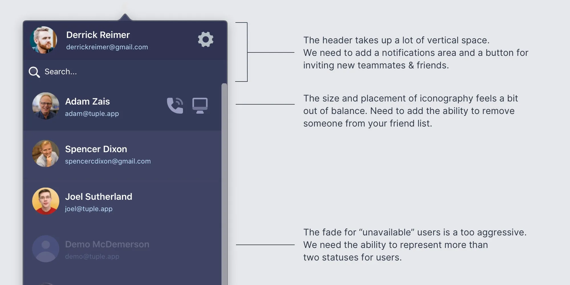
### Problems

The Tuple client (the installable Mac application that lives in the menu bar)
has sub-par UI/UX.

The following issues are paramount:

- People don't realize they can add an observer to a call
- People don't realize they can swap roles easily
- The changelog is hidden
- The "End" button is unclear
- Call controls are not clear to all users
- Inviting new users is hidden away and confusing
- Team directory is maybe not necessary
- Online status not clear

### Appetite

Let's keep this project to 4 weeks.
After reviewing the write-up, Ben and I hopped on a quick call to talk it through and fill in the gaps. My goal was to learn what items were most pressing and risky, in case we had to cut scope to stay within the 4-week budget.
Next, I jumped on a Tuple session with Spencer to talk through the technical details. I learned the interface is a React app that gets rendered in a Safari WebView and communicates with the Swift app through a JavaScript bridge. The Swift app is in charge of managing state, passing that state to the WebView, and listening for various commands issued from the React app.
Fortunately, the boundary between the React and Swift apps is quite clean, so we decided to build the new front-end in a separate codebase and compile it into the native codebase during the build phase.
Setting the foundation
The original codebase was clean and well-written, but it was beginning to show its age. It was mostly written in the pre-hooks era, so all the components were implemented with classes. CSS styles were embedded directly in the JavaScript, but we knew we wanted to utilize Tailwind CSS & Tailwind UI moving forward. The changes we wanted to make were significant enough that I decided to build new components from scratch instead of adapting the existing ones.
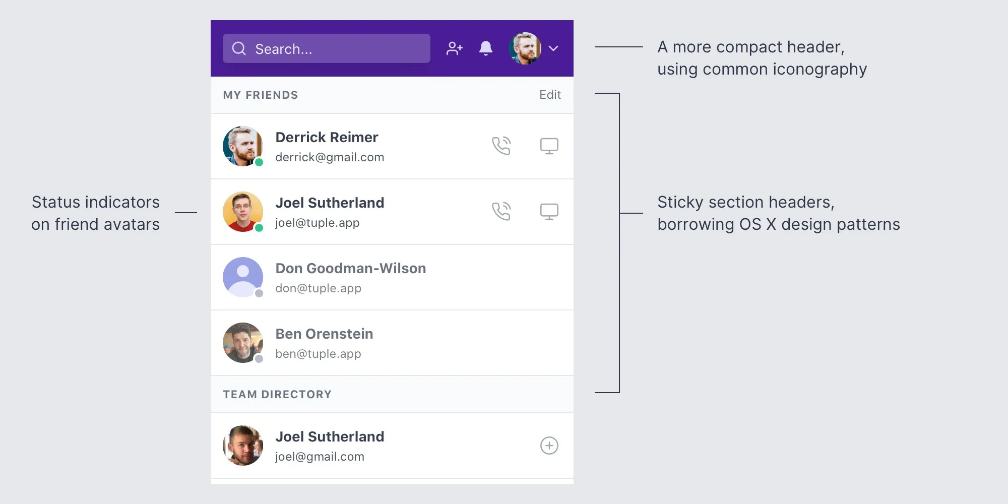
I chose to start with the main home screen to develop the new visual identity:
After sketching a bit with pen and paper, I cracked open my editor and created a new project. I prefer to prototype with HTML/CSS as early as possible, so I skipped the typical phase of prototyping in Sketch or Figma. Tailwind enabled me to style rapidly with utility classes.
Here’s how the main screen shaped up:
Connecting with people
Connecting with teammates and friends on Tuple used to be quite confusing. In the old interface, users had to click the gear icon to open a dropdown menu, where they could either choose to “Invite Teammate” or “Add Friend”:
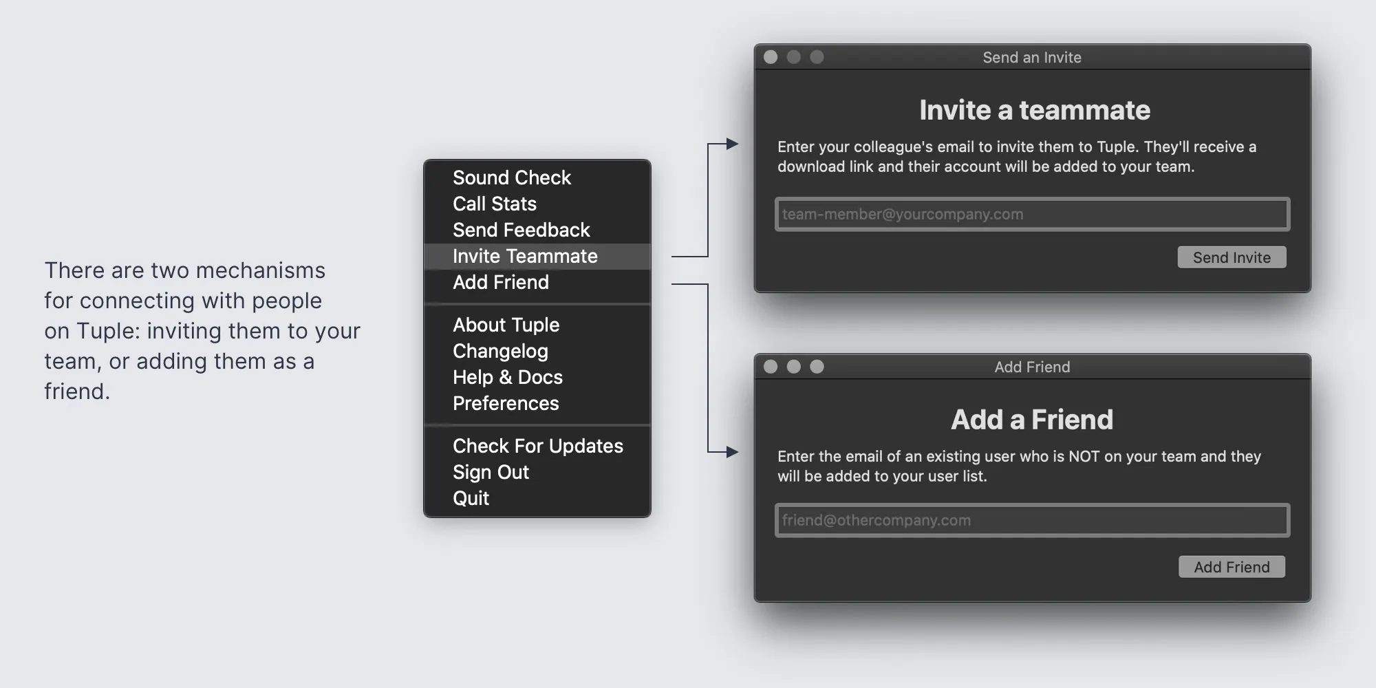
These two options sound confusingly similar, and customers often picked the wrong one. As someone quite familiar with the app, even I had to study the data model for a while to grasp the nuance.
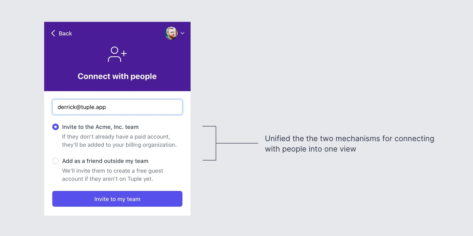
Ultimately, we decided it was best to unify these two forms under one view. Instead of forcing the user to choose upfront, we now funnel everything related to connecting with people through one interface: the “Connect with people” form.
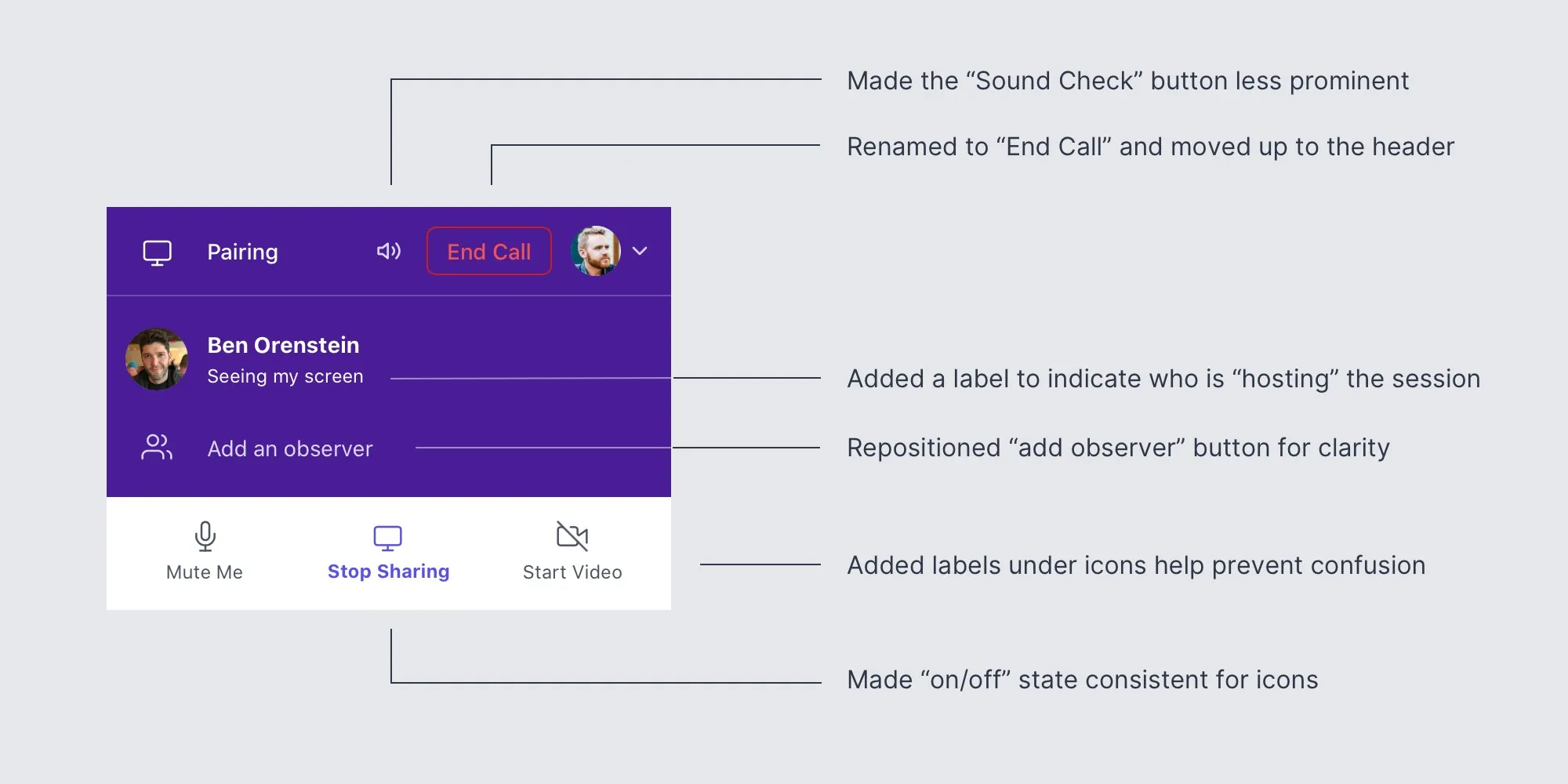
Smoothing out the in-call experience
The team identified a handful of UX issues with the in-call view:

Here’s how the new in-call view turned out:
Sharing progress with the team
This interface has a lot of different possible states — by the end of the redesign, we were handling over 25 distinct permutations. Fortunately, it was easy to simulate each state by passing mock data to the React app.
Our <App> component has two main props: a state object representing the state of the application, and a cmd function that dispatches commands back to the Swift application. Each time I designed something to handle a different permutation, I added a new instance to our demos page backed by a new state object in our /fixtures directory. Gradually, the page grew to represent every possible unique view users might see.
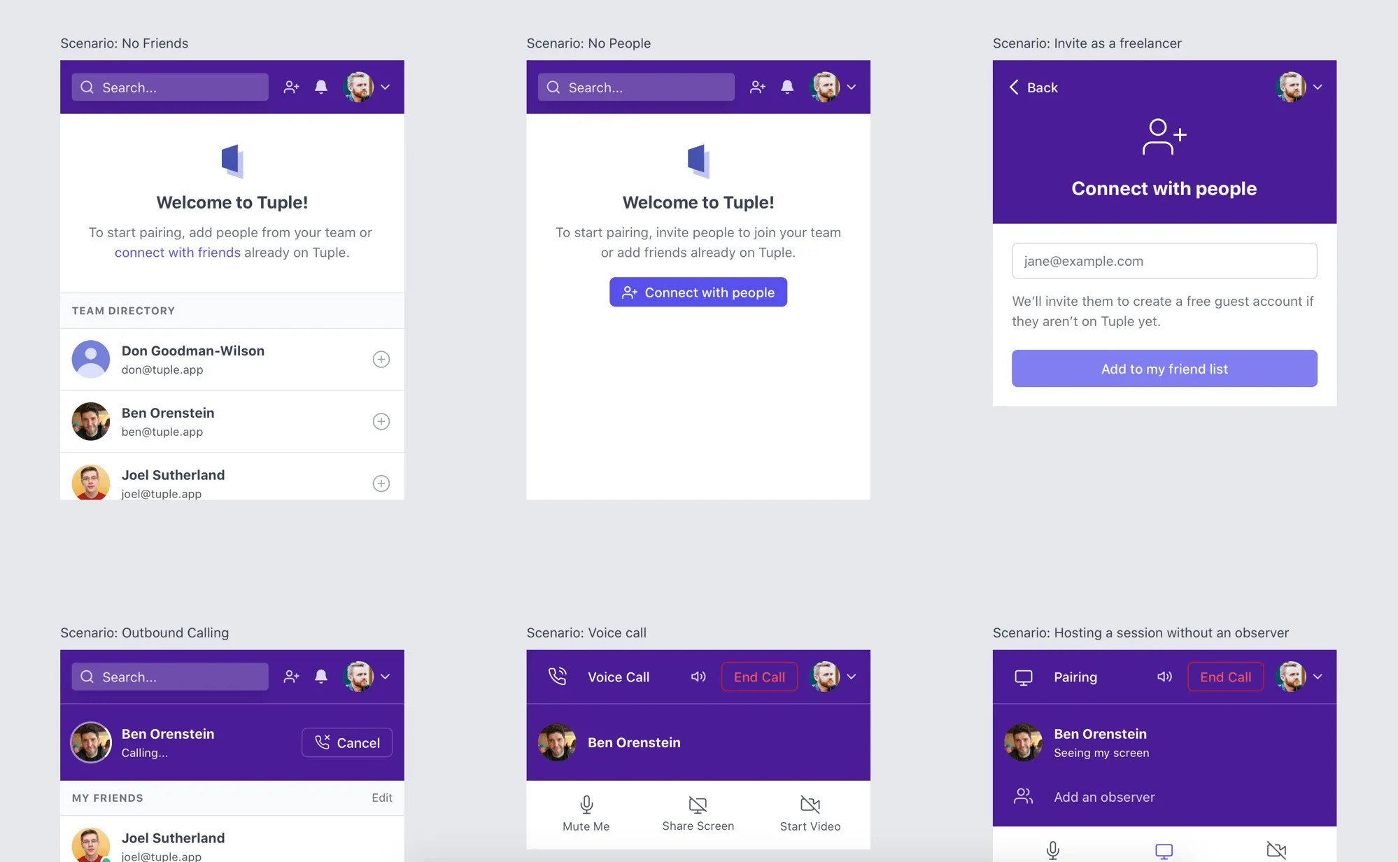
I also implemented a mock cmd function that would simulate changes to the state object, so the team could click around the app and get a feel for how it would behave in real life. For example, clicking the “Call” button would put the app into an “outbound calling” state and then, moments later, flip to the “in call” state to simulate someone answering the call.
Shipping
After about a month of development and iteration, Spencer plugged the new interface into the Swift application and pushed it live behind a feature flag. We chose a few of teams to beta test and give us feedback. This process unearthed a handful of small bugs and points of confusion, once again proving it’s impossible to anticipate every scenario that could use improvement.
We hope you enjoy the facelift and find Tuple app even easier to use!